Box and whisker plots for the command line
10/11/2025
Sometimes, it'd just be nice if you could visualize the distribution of a dataset quickly on the terminal without opening fancier tools. Enter, boxel.
boxel lets you plot boxplots by simply piping in some numerical data. Bewarned though, the cleaning and preparation of the data is up to the user!
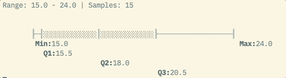
$ seq 10 | boxel

Range: 1.0 - 10.0 | Samples: 10


       ┠──────────────┨░░░░░░░░░░░░░░┃░░░░░░░░░░░░░░┠─────────────┨
        Min:1.0                                                     Max:10.0
                       Q1:3.25
                                      Q2:5.5
                                                     Q3:7.75
seq 10 simply lists all integers between 1 and 10 inclusive. Pipe it into boxel and it shows you the min and max values as well as the quartiles (Q1, Q2/median, Q3), a five number summary to help you understand the distribution.
Let's try something a bit more real...
Temperatures recorded at Heathrow Airport
1953 vs 1988 vs 2023
$ DATA=$(curl -s https://raw.githubusercontent.com/alanjones2/uk-historical-weather/refs/heads/main/data/Heathrow.csv)

$ paste <(echo "$DATA" | awk -F, '{if($2==1953){print $NF}}') \
      <(echo "$DATA" | awk -F, '{if($2==1988){print $NF}}') \
      <(echo "$DATA" | awk -F, '{if($2==2023){print $NF}}') \
 | boxel --bins 50 --no-colors
Range: 3.1 - 19.55 | Samples: 36


       ┠─────────────┨░░░░░░░░░┃░░░░░░░░░░░░░░░░░┠────────┨
        Min:3.1                                             Max:17.6
                      Q1:7.18
                                Q2:9.8
                                                  Q3:14.81


              ┠─────┨░░░░░░░░░░░░░┃░░░░░░░░░░░░░░░┠──────┨
        Min:5.25                                           Max:17.1
                     Q1:6.89
                                   Q2:10.65
                                                   Q3:14.98


                ┠─────────┨░░░░░░░░░░░░┃░░░░░░░░░░░░░░░░░░░░░░┠───┨
        Min:5.75                                                    Max:19.55
                           Q1:8.39
                                        Q2:12.1
                                                               Q3:18.41
Streaming input
By default, boxel blocks until the input pipe completes before drawing the results. You can use the --streaming flag to draw incrementally, say if you want to visualize latency distributions of a dusty old server for instance.
On Github
You can find it here. Bewarned, it's still not tidied up, I plan to package it up and publish to PyPI. Still may be useful though!